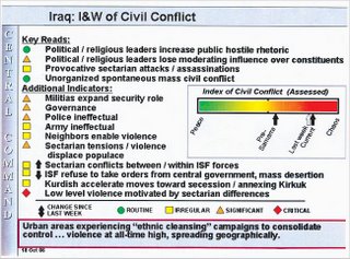
 Prior to the 'Incident in Sammarra' the scale shows the situation in Iraq as being neither peaceful nor chaotic, but simply yellow. Since Sammarra, however, the situation in Iraq has drifted from yellow to orange, and is now dangerously near red, or chaos. As passions continue to escalate there is no telling what will happen when the scale tips beyond the red of chaos.
As Dave's anonymous source commented after reading the paper, this chart looks as if "it were designed for a self-help seminar by an over ambitious bespectacled middle schooler named Ze."
Thank god the Pentagon has started using its brains and resources to prove a point.


No comments:
Post a Comment